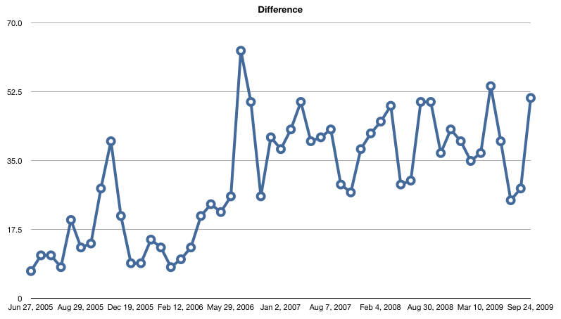
I recorded my fifty thousandth scrobble to Last.fm at the beginning of this past August. I recently found a site that can generate the dates on which you reached certain “milestones” in your scrobbling history. Since I have a rather large data set, I thought it would be neat to visualize my listening over the past four years.
This first image is a graph of the number of days it took me to listen to one thousand tracks. Looking at the chart, I can tell that I have been taking longer to listen to the same amount of music, but I have no idea why. It also seems that I have recently started going through phases of listening to a relatively large amount of music and then stopping, rinsing, and repeating.

The next image just corroborates what the other chart implicated: I don’t listen to music as much as I used to. It shows a graph of the moving average of the number of days it takes me to listen to my next one thousand tracks. I bet that a graph that charts when and how much music is added to my iTunes library would both match up with these charts and show a significant slowdown over the past few months and years.

There are fifty one milestones in these charts represented by forty five different artists. Four different artists appear more than once. There are no individual songs that appear more than once. My top three overall artists appear on the list, as do five of my top ten.